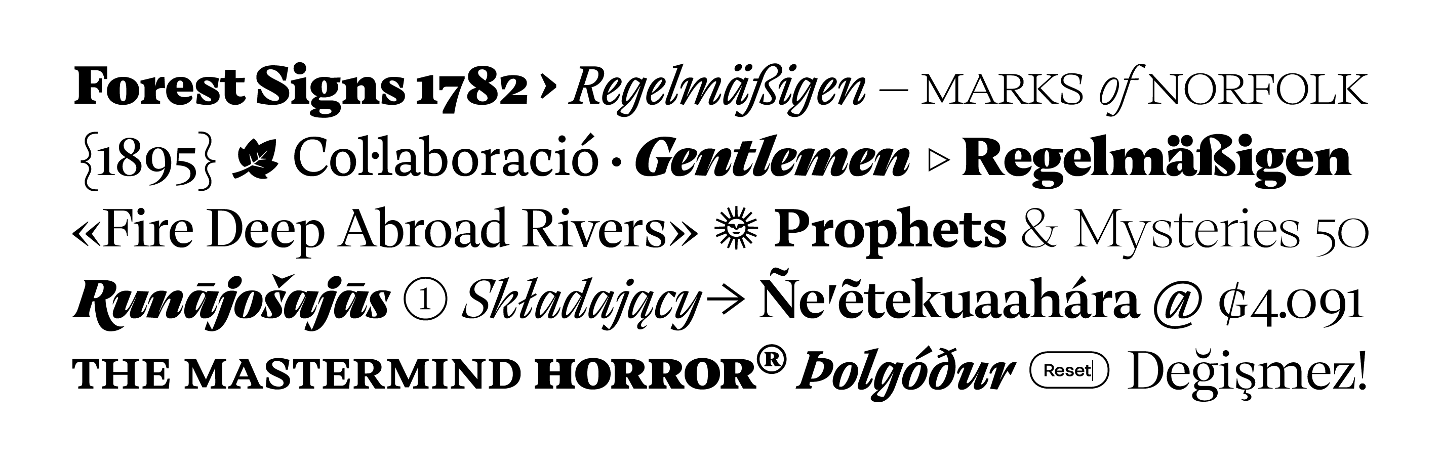
Thermal has many faces; it can be sharp and cold or warm and inviting. This duality forms its essence, generating contrast between styles without losing consistency along the way. Contrast and balance are the key ingredients of this typeface, combining the elegance of classical typography with the sharpness of contemporary design. This combination makes Thermal highly legible in text and unique in its visual character at large sizes. One of the core ideas behind Thermal's process was to create a typeface that the user could play and have fun with, it's a typeface meant to be explored. It offers an extensive array of options: +1.330 glyphs per style, with alternates, swashes, pictograms, etc., all packed inside a variable font. The user can play with two axes at the same time: weight and optical size, providing more control and flexibility.
Designed by: Fernando Díaz
Version №: 1.2 (November 2023)
Weight & Optical Size
It's very common nowadays to see typefaces with a wide range of weights, as it's important for designers to establish hierarchies, making it easier for the viewer to understand the order in which they should absorb the information, helping to guide the reader's eye, and making information more accessible and legible. Using different weights also helps to add variety and interest to a design while making it look consistent, creating contrast and highlighting certain elements while remaining cohesive. Having this broad amount of weights gives designers flexibility when working on a project with multiple viewing conditions, being able to adapt to any circumstance: print/screens, nighttime/daytime. That's why Thermal has a weight axis with the capability to be fluid, so you can choose between 800 different possibilities to fine-tune according to your needs.
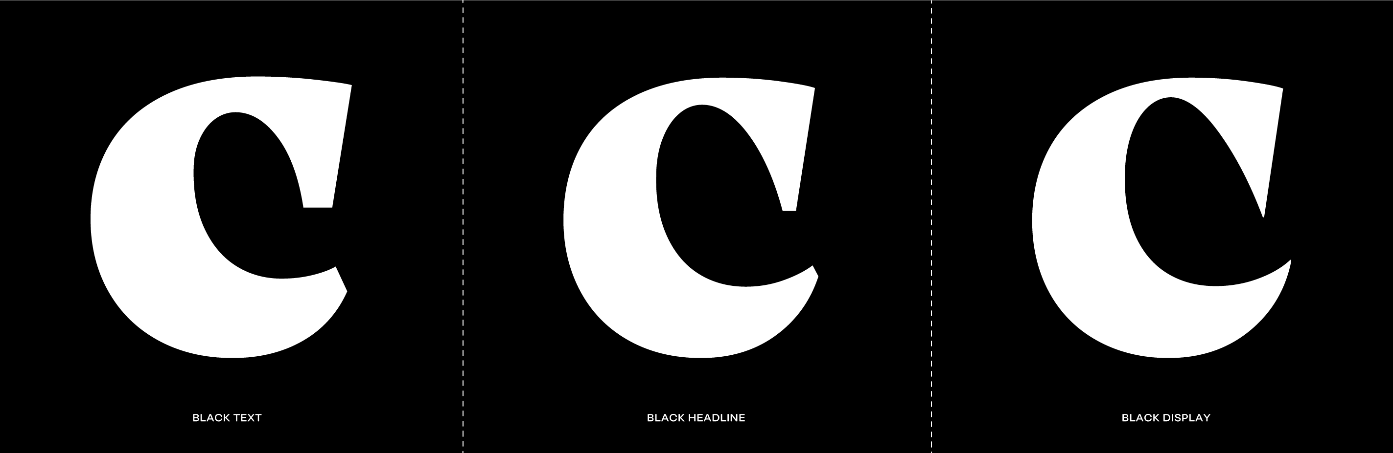
But what about optical size? This concept is not as common as weight. Originally, when typefaces were made of metal or wood, they had different drawings for each size. For small sizes, the letterforms were simple and robust, in large sizes, they had a great deal of contrast and detail. When type became digital, there was a need to preserve those design differences between sizes, so optical sizing was a way to keep its design intent at different sizes. However, Thermal uses this axis not to preserve the design across sizes, but to enhance its personality. It changes shape dramatically according to the optical size you choose. The text styles are sturdy, with low contrast and thick serifs. This is scientifically demonstrated to be legible for small sizes and long texts. On the other end, the display styles have a lot of contrast between thick and thin stokes, less spacing and hairline serifs. The advantage of being a variable font with two axes is that the user can play and choose the right point of each axis to have the perfect mix.
Thermal has many faces, it can be sharp and cold Thin Italic Display or warm and inviting Black Text, this is part of its personality, a decided contrast between its styles but without losing consistency along the way. Contrast & Balance, those are the key ingredients of this typace, combining the elegance of classical typography with the sharpness of contemporary design.
Historical background
Typography is rooted in history, like a tapestry that weaves through time to influence contemporary design. In the early stages of Thermal's design, we've started by drawing the heavy display styles, trying to pay homage to the enduring letterforms that have captivated type designers and viewers alike for centuries, taking inspiration from the past but reinterpreting classical letterforms for our times. The 19th-century wood type revolution brought warm and robust display characters with organic serifs. These were designed and cutted using the pantograph, a new tool that allowed for a higher level of precision across different sizes. Those bold letterforms resonated with the readers of the time and left a lasting imprint on type history. A century later, in the psychedelic 1960s and 1970s, those organic serifs found new meaning, capturing the spirit of freedom and vibrancy of those decades. They were used in concert posters, album covers, and were a visual synonym for the era's avant-garde mindset.
Within this historical framework, Thermal's Display styles were conceived as a blend of the pantograph's precision and the psychedelic movement's boldness, resulting in shapes that are both nostalgic and contemporary, that influenced the whole family. After the Display was on the way, we designed the Text styles, for us it was important that this serif typeface was versatile and readable. To achieve this, we adjusted the contrast, made the serif thicker, and fine-tuned spacing to work better in paragraphs.
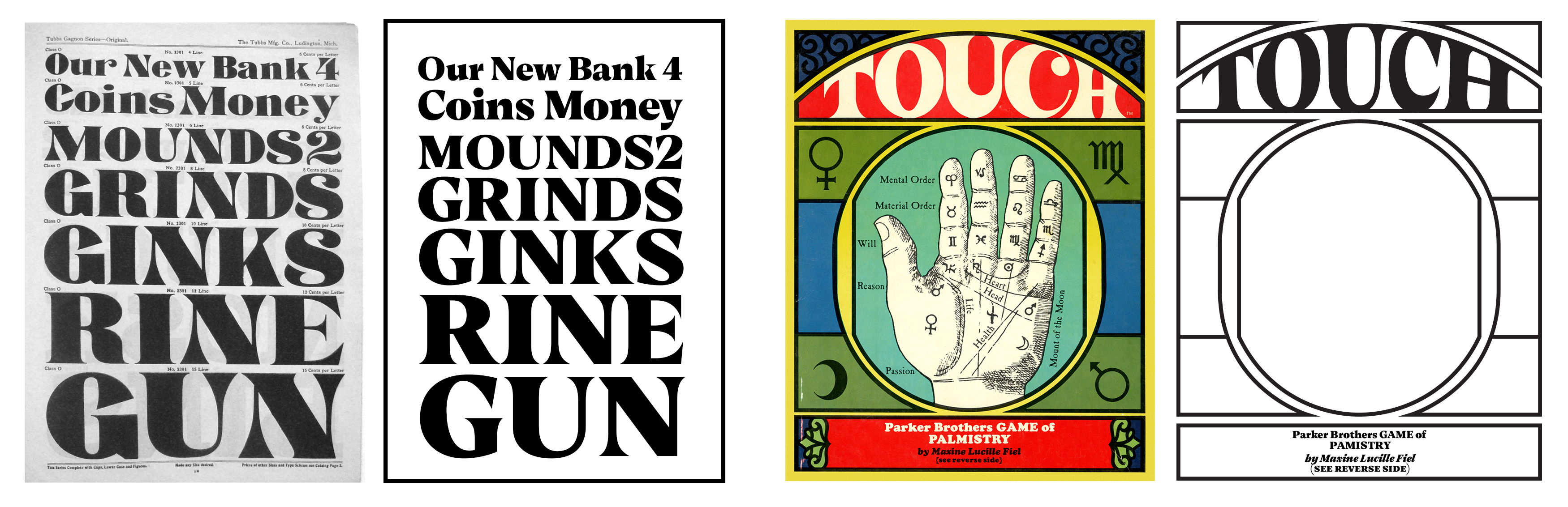
← 1880s — TUBBS: Wood Type Specimen. Tubbs & Co. South Windham, Connecticut.
→ 1970s — TOUCH. Parker Brothers Game of Palmistry by Maxine Lucille Fiel.
For the Italics, we sought to create not merely a slanted version of the uprights, but a distinct typeface altogether, one that would offer an interesting contrast with the regular styles. One of Thermal's distinct features is its 20° inclination (a significant inclination by any standard). Another characteristic is the razor-sharp calligraphic strokes that provide a sense of dynamism and energy. These design choices have their roots in one of our favorite books from our studio's collection: Augustini Mascardi Siluarum libri 4 (Augustine Mascardi of the Forest, Book 4), printed by the renowned French printer Christophe Plantin (1520–1589), who resided and worked in Antwerp. Besides the wonderful frontispiece by Rubens, this book has an exquisite typeface from the famous French punchcutter Robert Granjon (1513–1590) called Ascendonica Cursive cutted in 1571. This typeface served as the direct inspiration for Thermal's italics. Many type designers have made revivals of this typeface, so our goal was not to be historically faithful, but to create a respectful contemporary interpretation that generates a captivating contrast with the rest of the family. Thermal studies the past and analyzes the present to create a unique blend, bringing a distinct dichotomy and an eclectic identity.
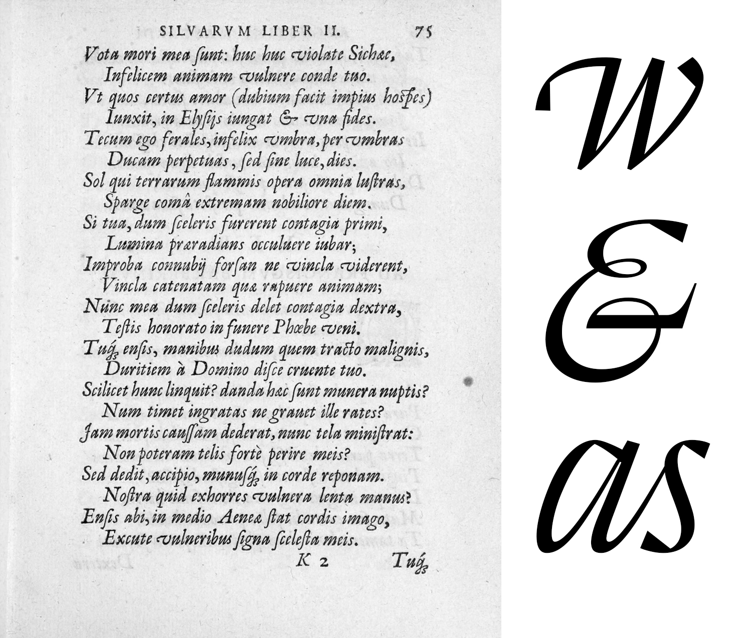
Page 75 of the book "Augustini Mascardi Siluarum libri 4. Ad Alexandrum principem Estensem S.R.E. cardinalem". Printed by Christophe Plantin with a frontispiece by Rubens and the exquisite typeface Ascendonica Cursive Robert Granjon. The calligraphic influence is evident, the triangle shapes of some of the letters are inspired by some sort of Chancery hand. The inclination of some of the letters is very steep. Many characters are a work of art on their own, but the ampersand is one of our all time favorites!
Hidden Gems
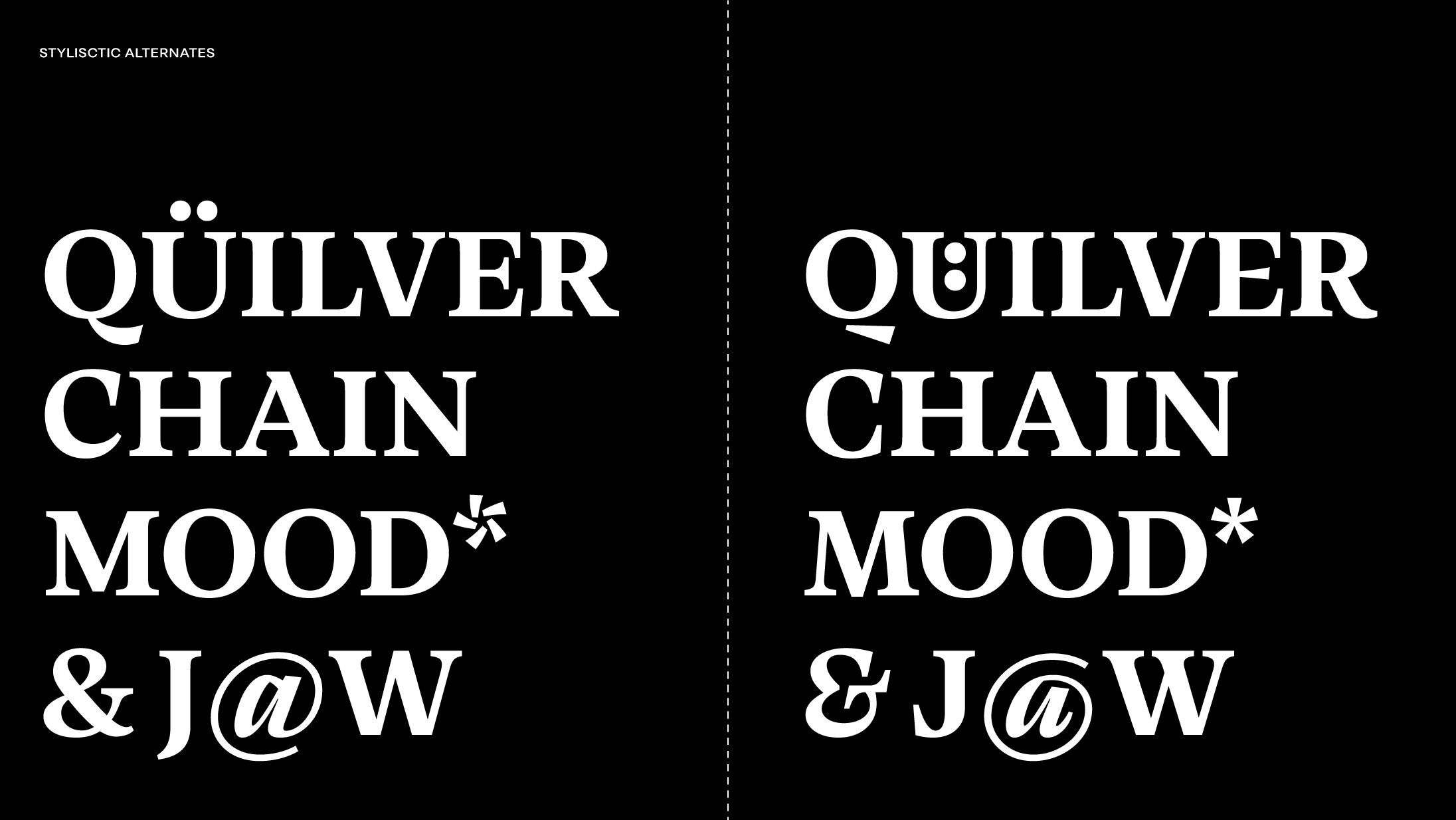
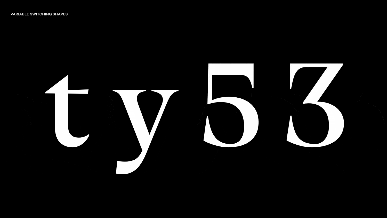
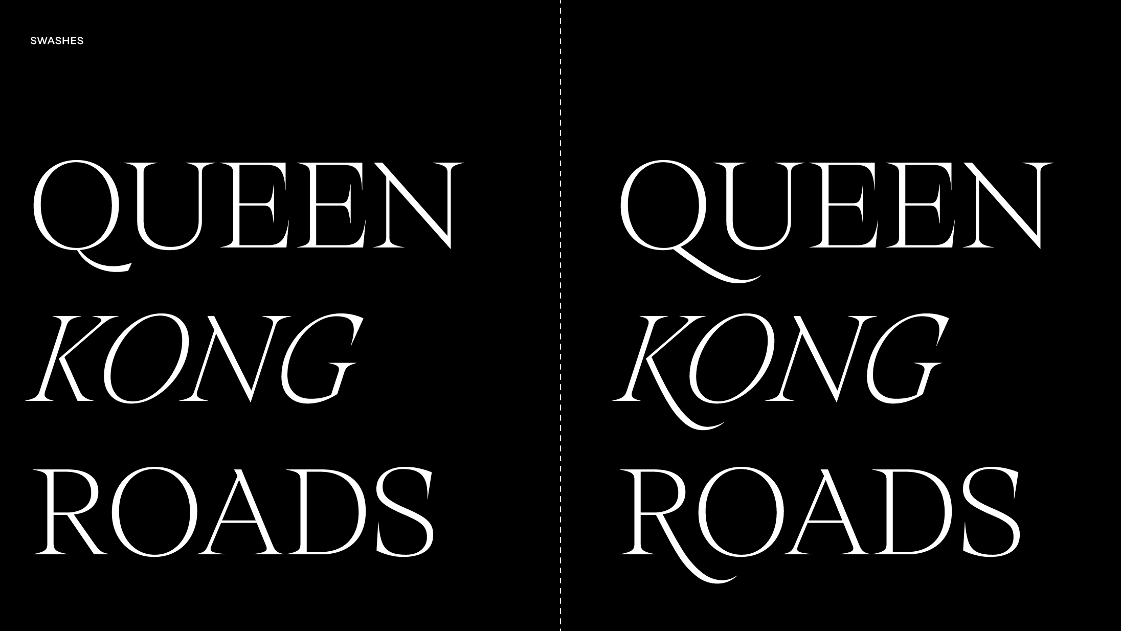
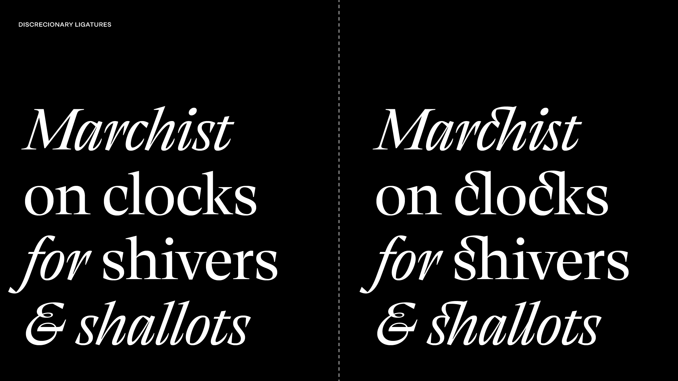
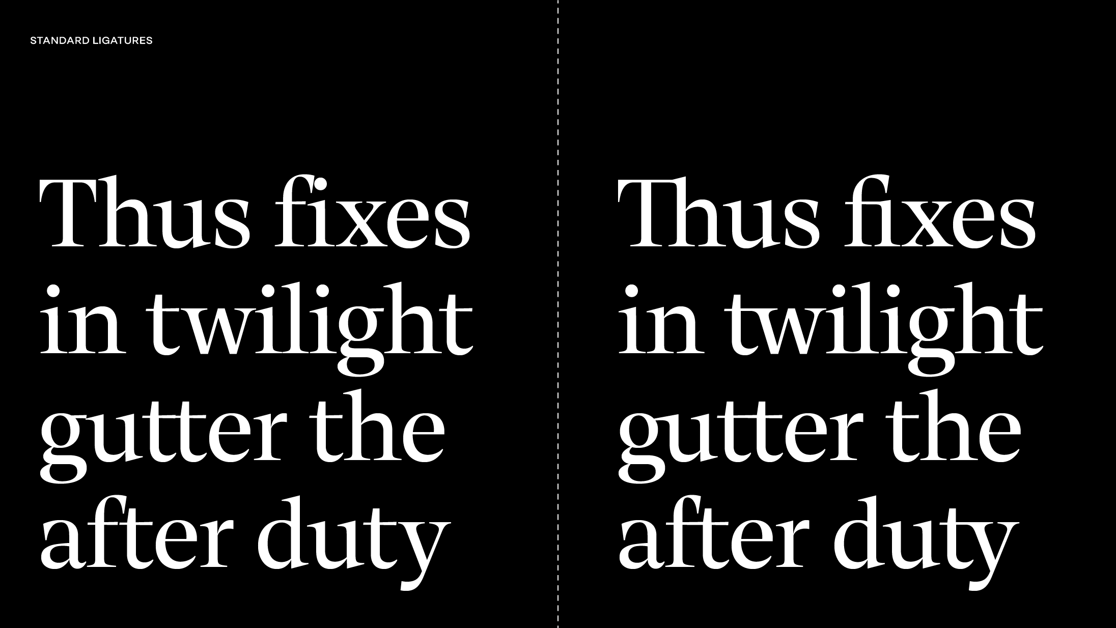
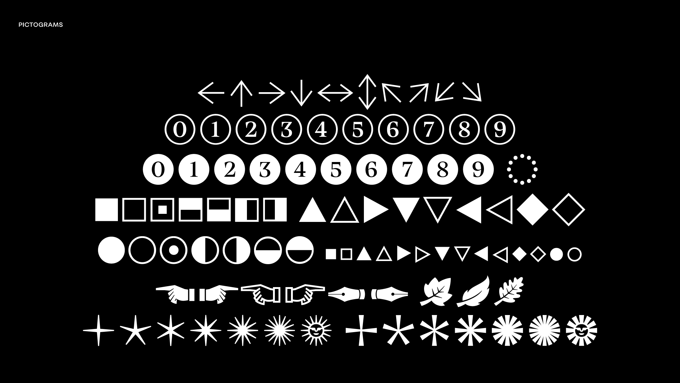
Thermal has the typical open type features: Number Sets (lining, oldstyle, tabular, slashed), Small Numbers (denominators, sub and superscript, numerators, scientific, fractions, ordinals), Small Capitals, Ligatures, Localized Forms, Capital Spacing, Case Sensitive Forms. But, if you are an advanced user, you can take advantage of some of these features.