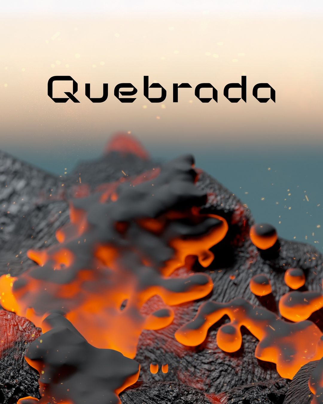
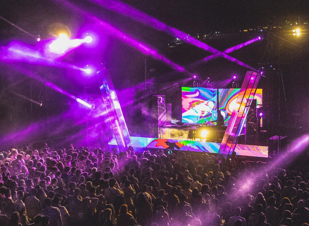
A new variable logotype design for a cultural event in Uruguay

Quebrada, previously known as "Senderos", recently underwent a makeover, both in name and appearance. Led by Juan Palarino, the rebranding project aimed to capture the essence of movements and rhythms displayed at this cultural event.
Project: Logotype design
Client: Quebrada
Year: 2024
Concept
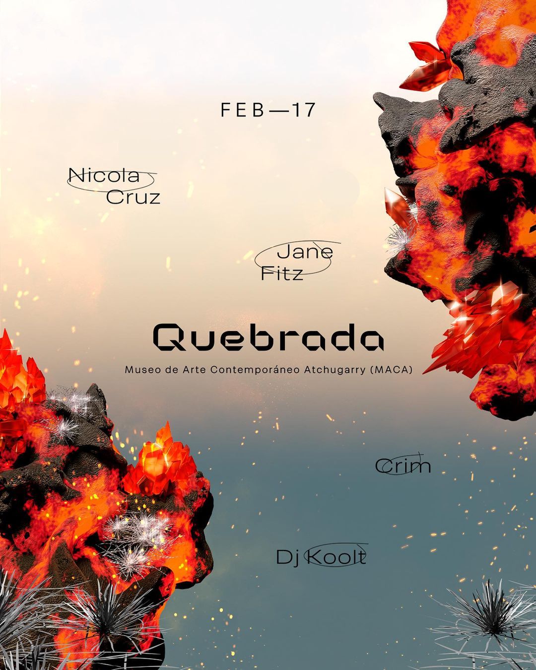
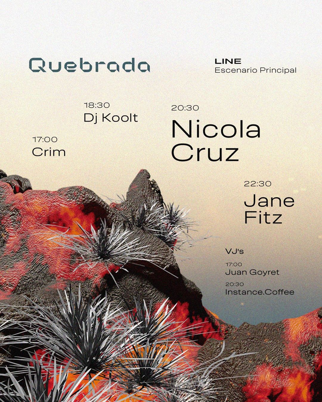
Described as a blend of strength and fragility, Quebrada's new identity sought to embody these qualities visually, reflecting its vibrant energy and adaptability.
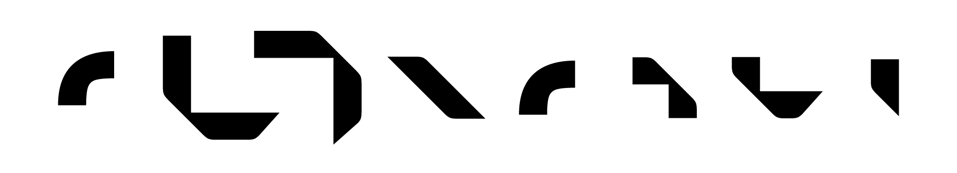
Design
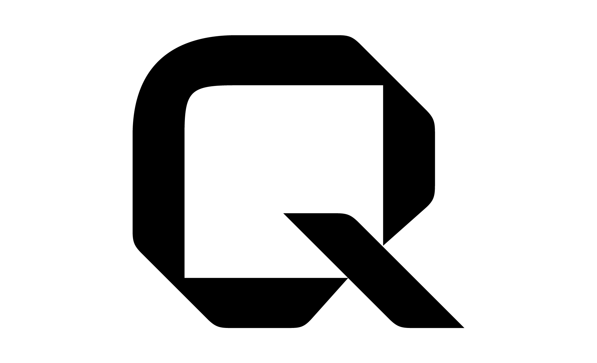
The shape explorations revolves around representing the brand's main concepts. The new typography takes advantage of the opportunity for change to generate visual elements that signify a break and accompany the essence of the event. Quebrada embodies music and gathering. It is flexible, adapting to its environment, and denotes modernity and technology.
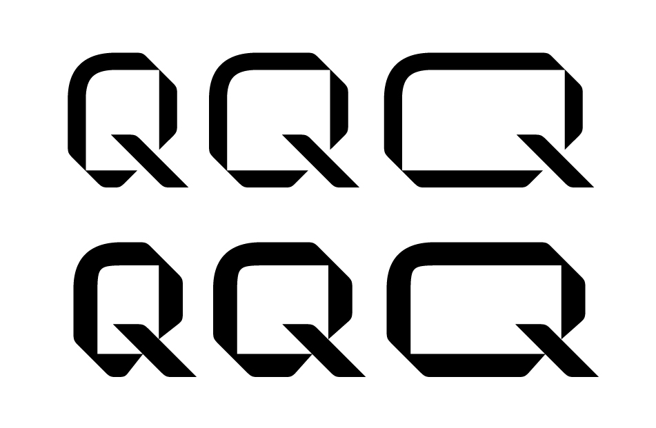
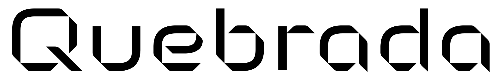
The new typography embraced a modular design, striking a balance between complexity and simplicity, ensuring versatility across various applications.
Quebrada's logo was designed to be responsive, reflecting its dynamic nature and ability to evolve with its surroundings.
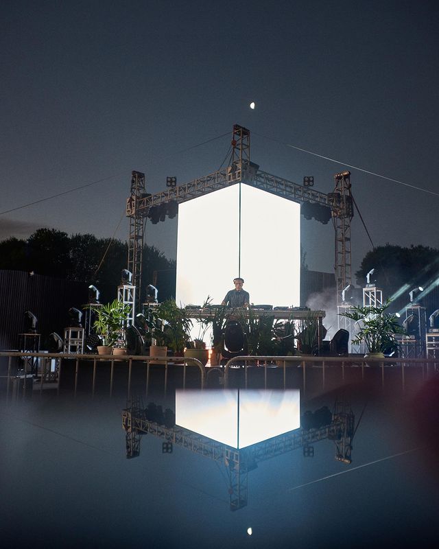
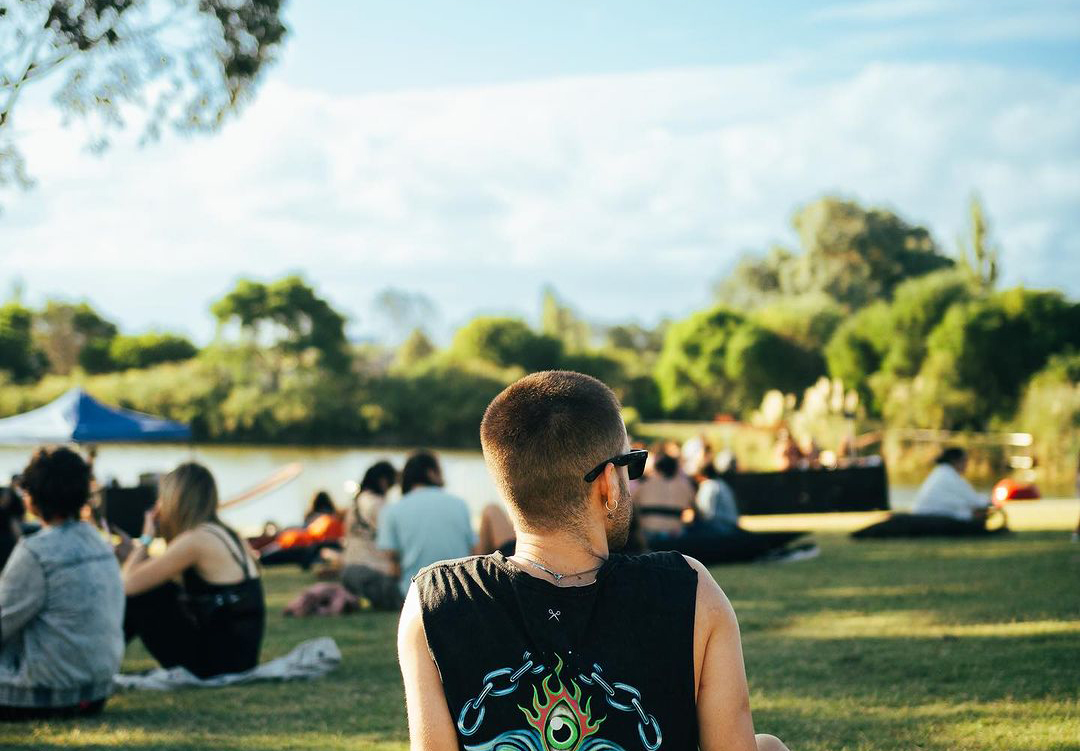
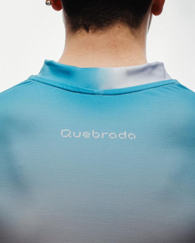
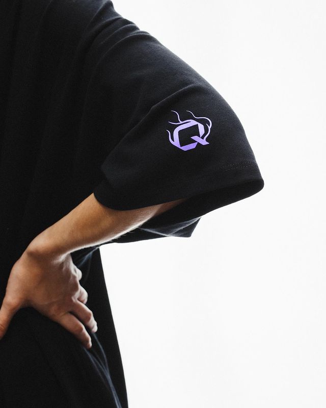
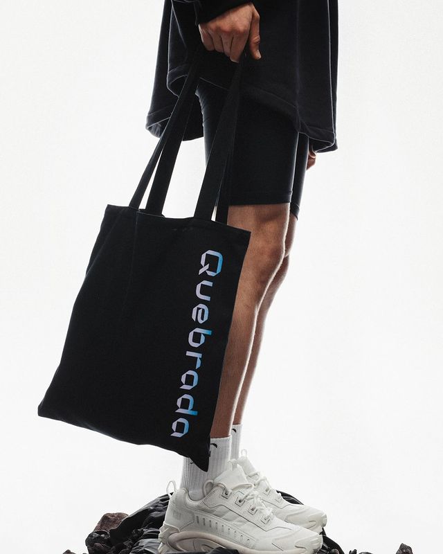
In Use
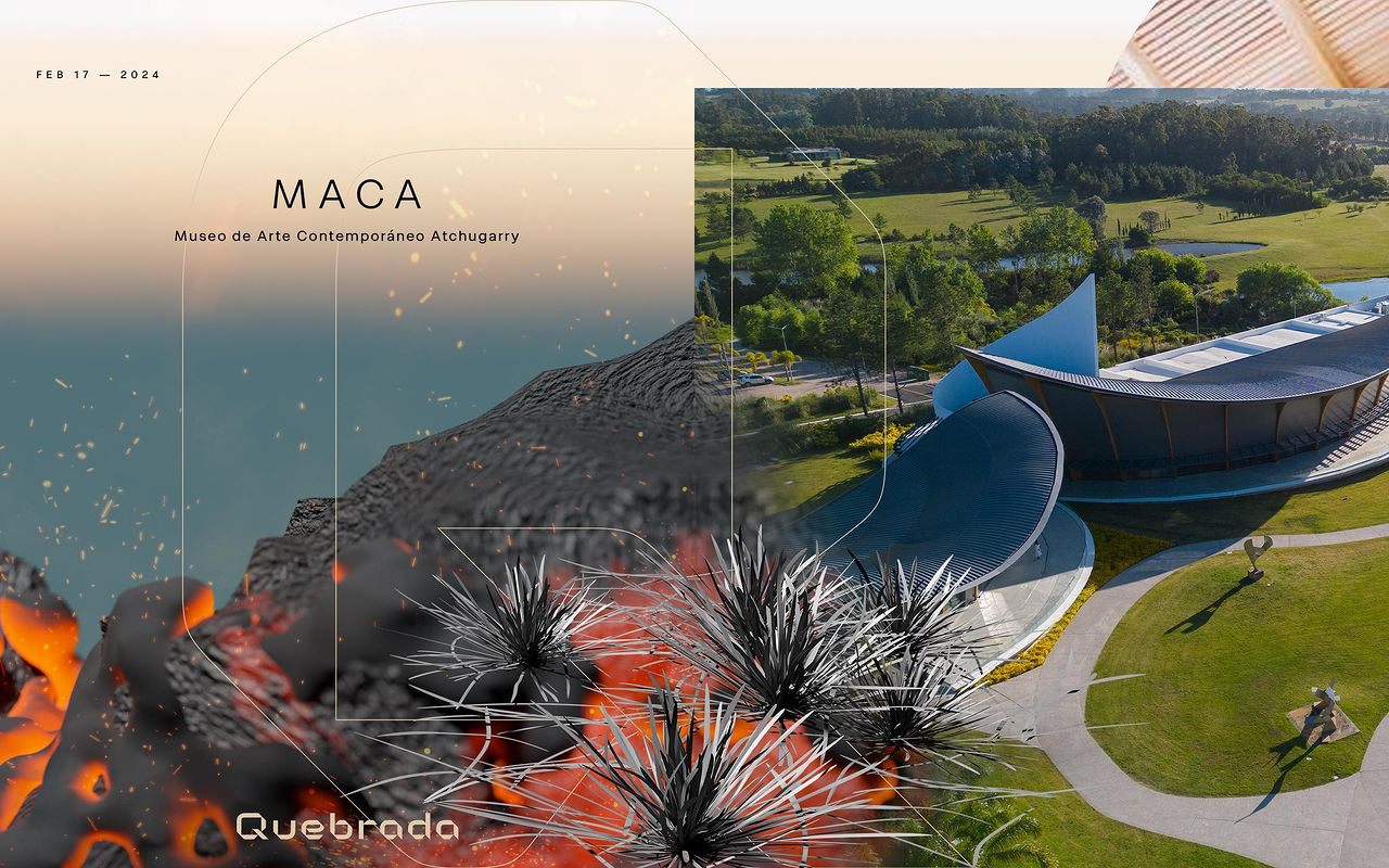
From static imagery to animated graphics, Quebrada's visual identity was crafted to be adaptable, ensuring consistency across different communication channels.
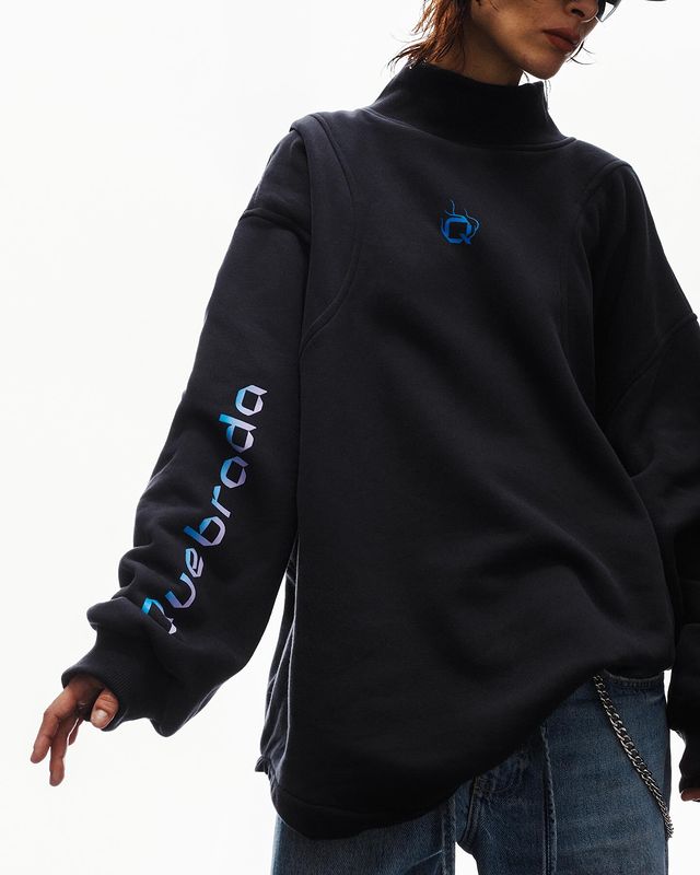
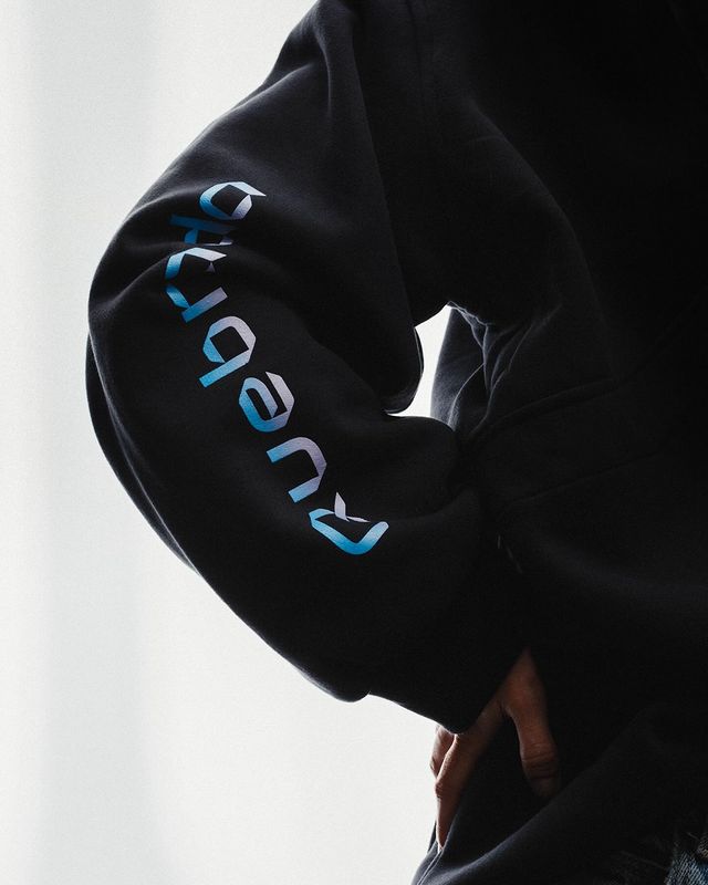
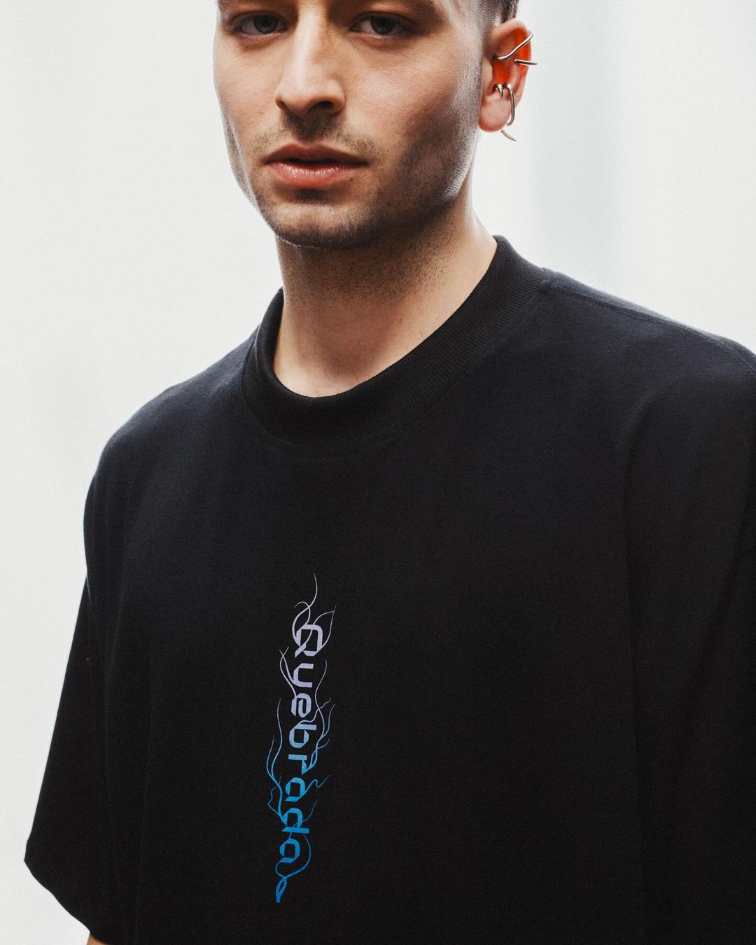
Incorporating RST Reactor typeface to the visual identity added depth to Quebrada's visual narrative, complementing its new logo seamlessly. View more about RST Reactor