A bridge between two moments in time, a reinterpretation and revival of a typeface originally designed by Hans Brünnel in 1937 a collaboration across ninety years.
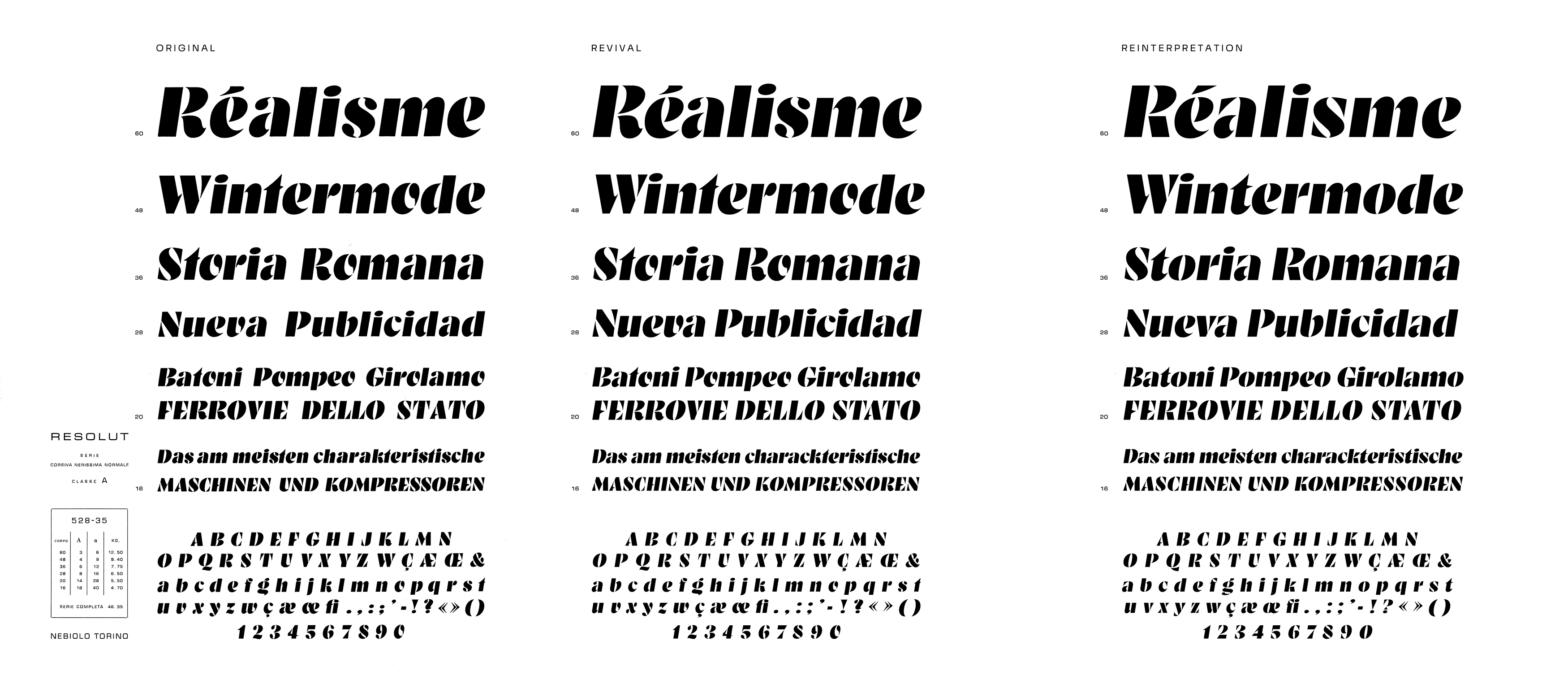
RST Resolut is a bridge between two moments in time, a reinterpretation and revival of a typeface originally designed in 1937 by Hans Brünnel for the Italian Nebiolo Foundry. The original Resolut existed as a single stencil heavy weight, a striking design with a distinctive personality shaped by the creativity and technical constraints of its time. It emerged during a period when expressive display typography flourished, and its bold forms reflect the experimental spirit of that era.
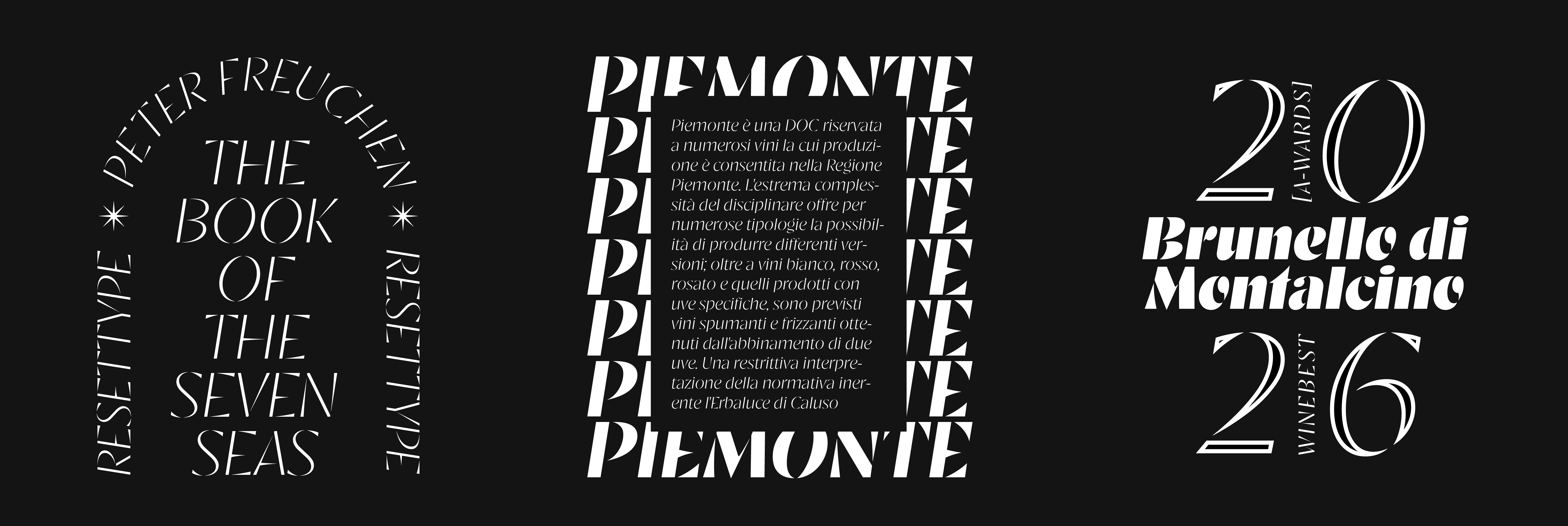
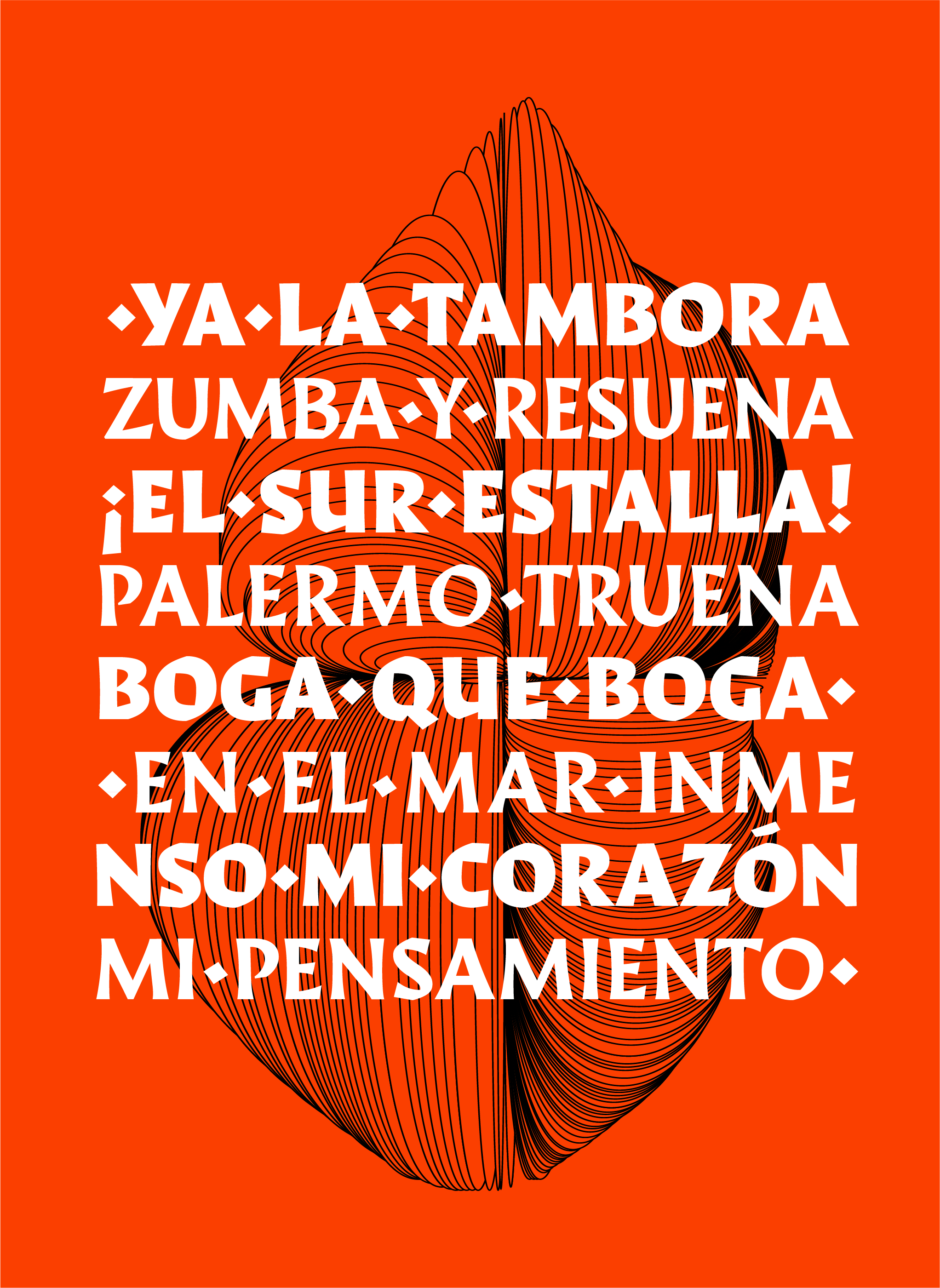
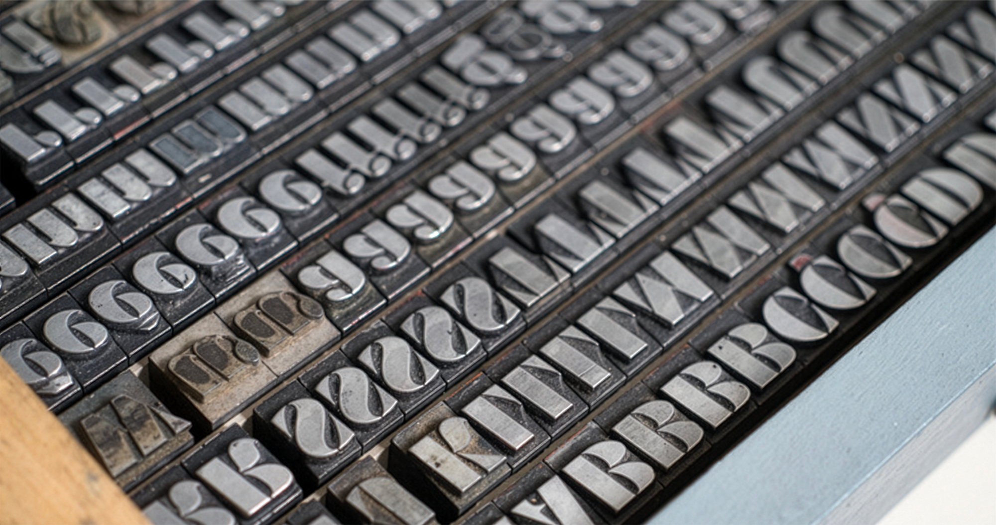
Stencil typefaces occupy a unique position in typographic history. Unlike most letterforms, their shapes are defined not only by aesthetics but also by the physical constraints of production. The breaks within the strokes, necessary to keep the counters intact when the stencil plate is cut, create a distinct visual rhythm that separates stencil letters from conventional typography. Over time, these interruptions evolved from purely technical necessities into expressive design elements that contribute to the character of the letterforms themselves. Historically, stencil lettering predates many forms of typographic practice, appearing in applications ranging from liturgical books to industrial marking and architectural drawing. Yet as typographic objects, stencil typefaces arrived relatively late. Even in the mid-twentieth century they were sometimes described as a “neglected category of type design,” despite the long presence of stencil lettering in everyday visual culture. Their eventual adoption into typefounding brought with it a shift in perception: the breaks that once seemed like flaws began to be treated as defining features of a new typographic language. For a more detailed account of stencil history, see A Tradition With Breaks by Eric Kindel here. In Resolut, those structural interruptions become central to the design’s identity. The breaks introduce tension and movement, giving the letters an architectural quality that feels both industrial and expressive. The result is a design that balances geometry, tension and elegance, capturing the experimental spirit of early twentieth-century display typography.
Revival
As early as 2021, I encountered Resolut while reading a book on the history of football in Uruguay. Its cover featured a typeface that immediately drew my attention: bold, unconventional, and strikingly modern. This initial encounter led me to further research, eventually tracing the design back to its origins as a metal typeface produced by the Nebiolo Foundry. A reference on Fonts In Use confirmed its identity. What stood out was its apparent dissonance with its time: despite being designed in 1937, it carried a sense of originality that still feels contemporary today.
Designed by: Fernando Díaz
Font Production: Amparo Guindón
Original Design: Hans Brünnel
Version №: 1.0 (March 2026)
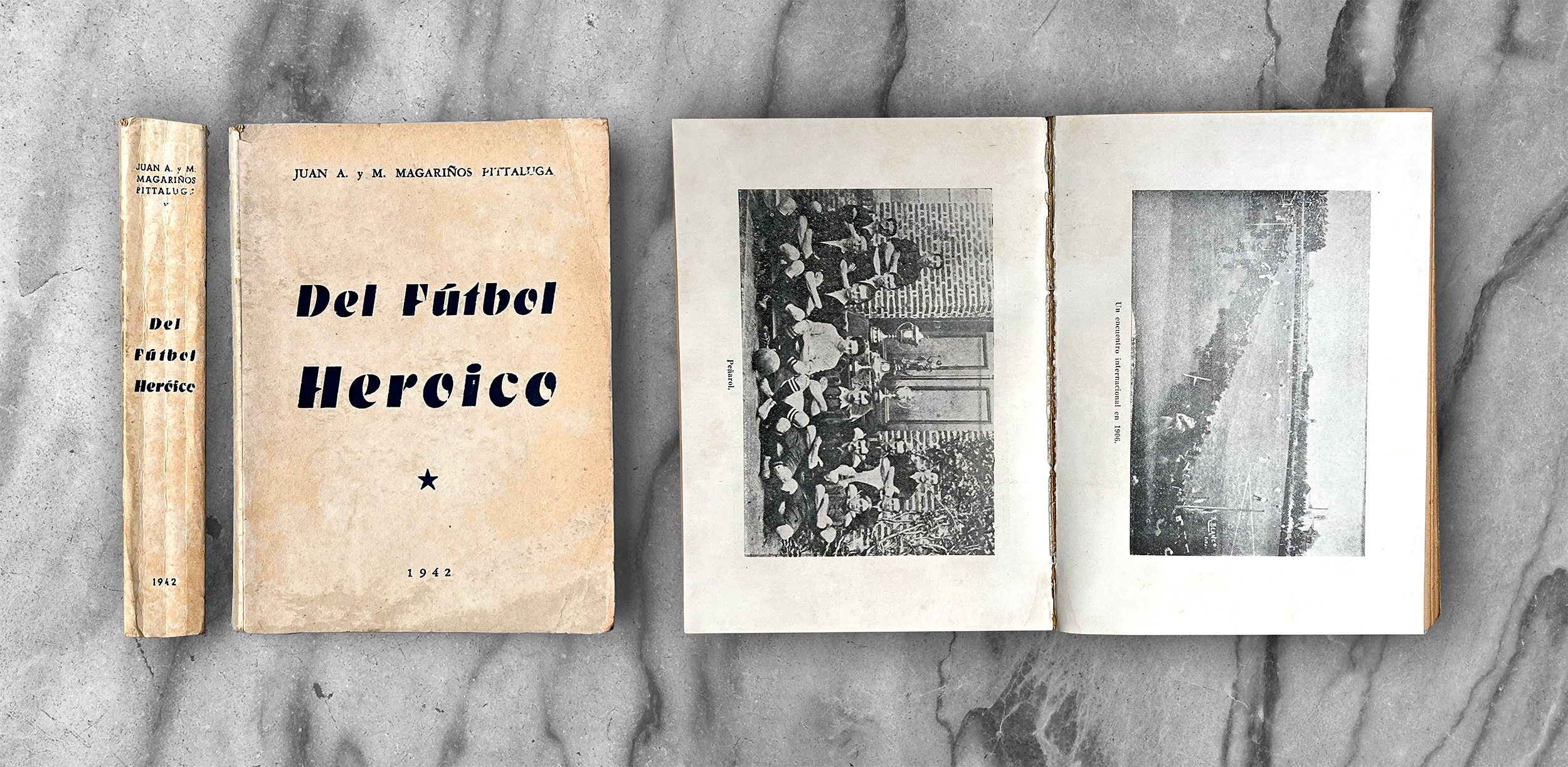
↑ 1939 — Del Fútbol Heróico by Juan A. y M. Margariños Pittaluga.
(The image on the left shows the Peñarol team, which I support)
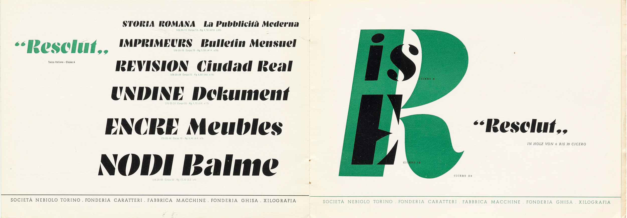
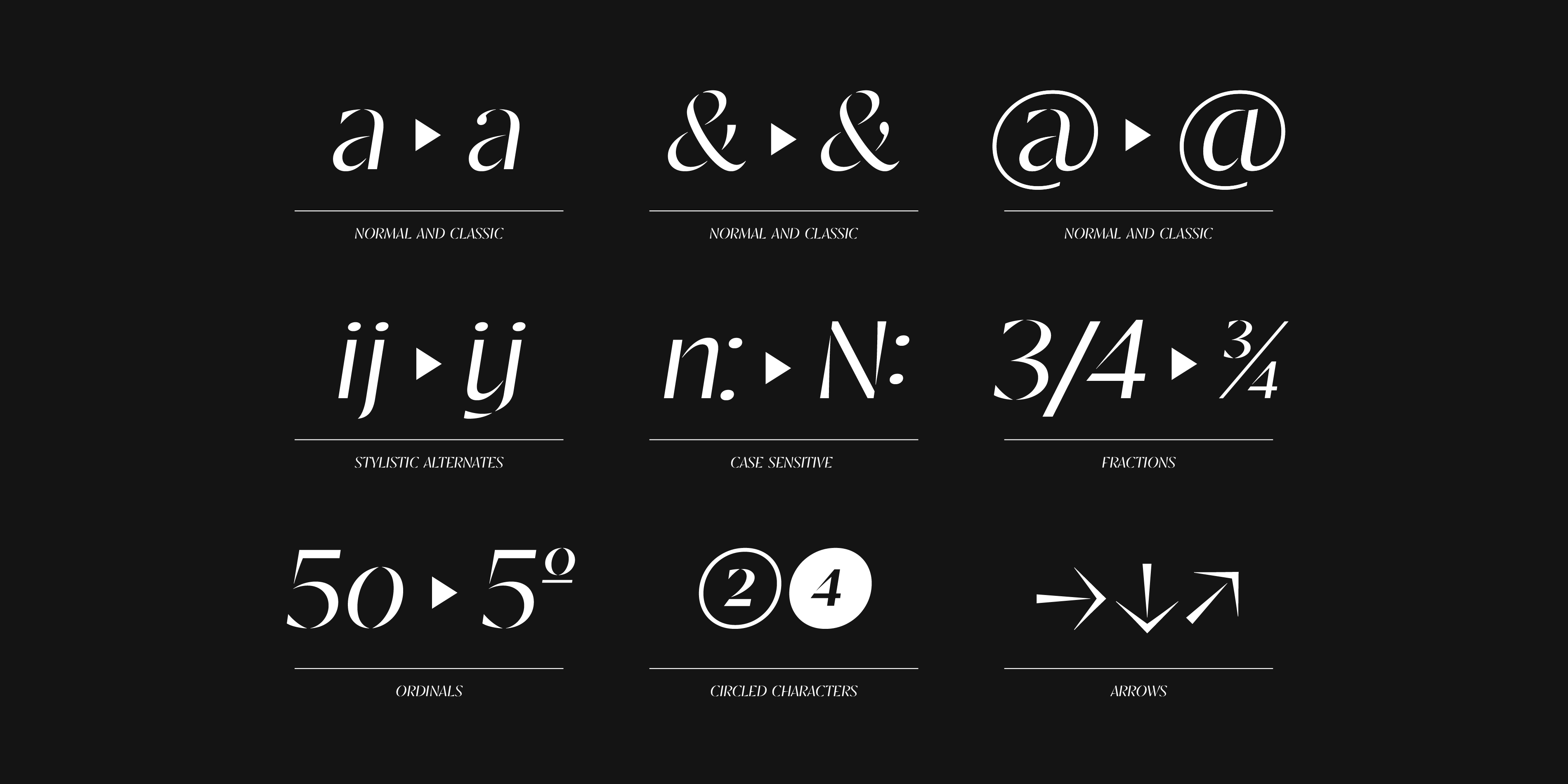
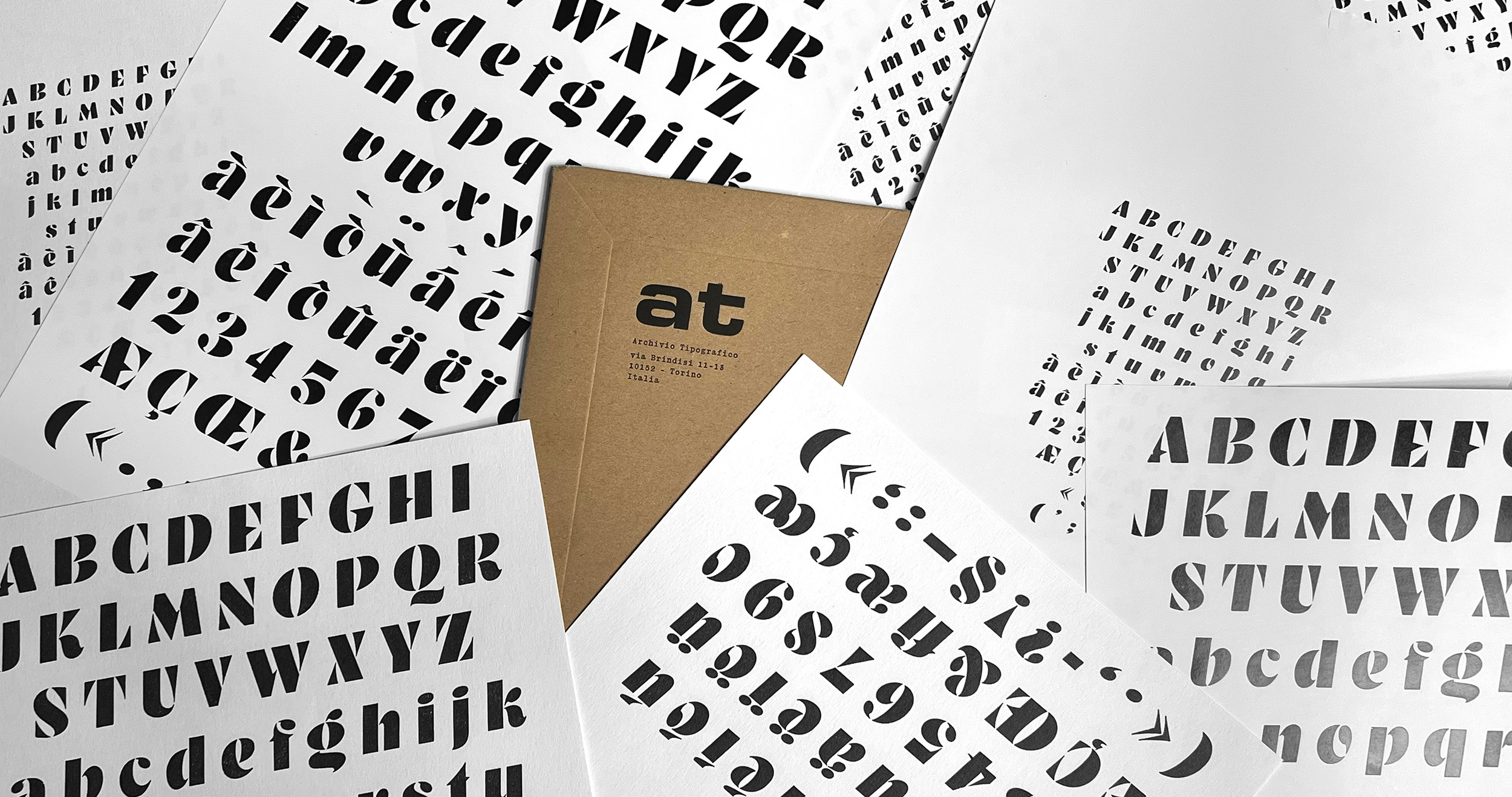
The development of RST Resolut began a year later, guided by a desire to revisit the original work with both care and curiosity. High-definition scans provided by Gabriele Fumero at Archivio Tipografico made it possible to study the original forms with precision. These materials allowed for close observation of the letterforms, revealing subtle decisions embedded in the design: the proportions between vertical and horizontal strokes, inclination, the balance between geometric construction and optical correction, and the way the stencil bridges influence the overall rhythm of the alphabet. Working from these archival references ensured that the revival remained grounded in the authentic shapes, proportions, and character of Brünnel’s design. Several typefaces have drawn inspiration from the original Resolut over the decades, each interpreting its bold stencil structure in different ways. This project, however, approaches the design from a more personal perspective. The intention was not simply to reconstruct a historical artifact, but to explore what the typeface could become if its underlying logic were extended into a broader typographic system.
The process inevitably involved interpretation. Historical specimens rarely provide a complete typographic system. Many letters appear only in limited contexts, spacing information must often be inferred, and the transition from metal type to digital format introduces possibilities that did not exist in the original medium.
Reinterpretation
This required asking a simple but challenging question: what defines the essence of Resolut? Is it the weight of the strokes, the distinctive stencil breaks, or the geometric foundation that organizes the forms? The strength of the original design lies in the relationship between these elements. The letters balance structural rigidity with expressive energy, producing forms that feel both mechanical and dynamic. From this perspective, RST Resolut becomes less about preserving every historical detail and more about preserving the structural thinking behind the original design. The revival therefore treats the historical specimen as a starting point rather than a boundary. In this sense, the typeface becomes almost a collaboration across nearly ninety years. The project attempts to imagine how the design might evolve if its original logic were allowed to grow within a contemporary typographic environment.
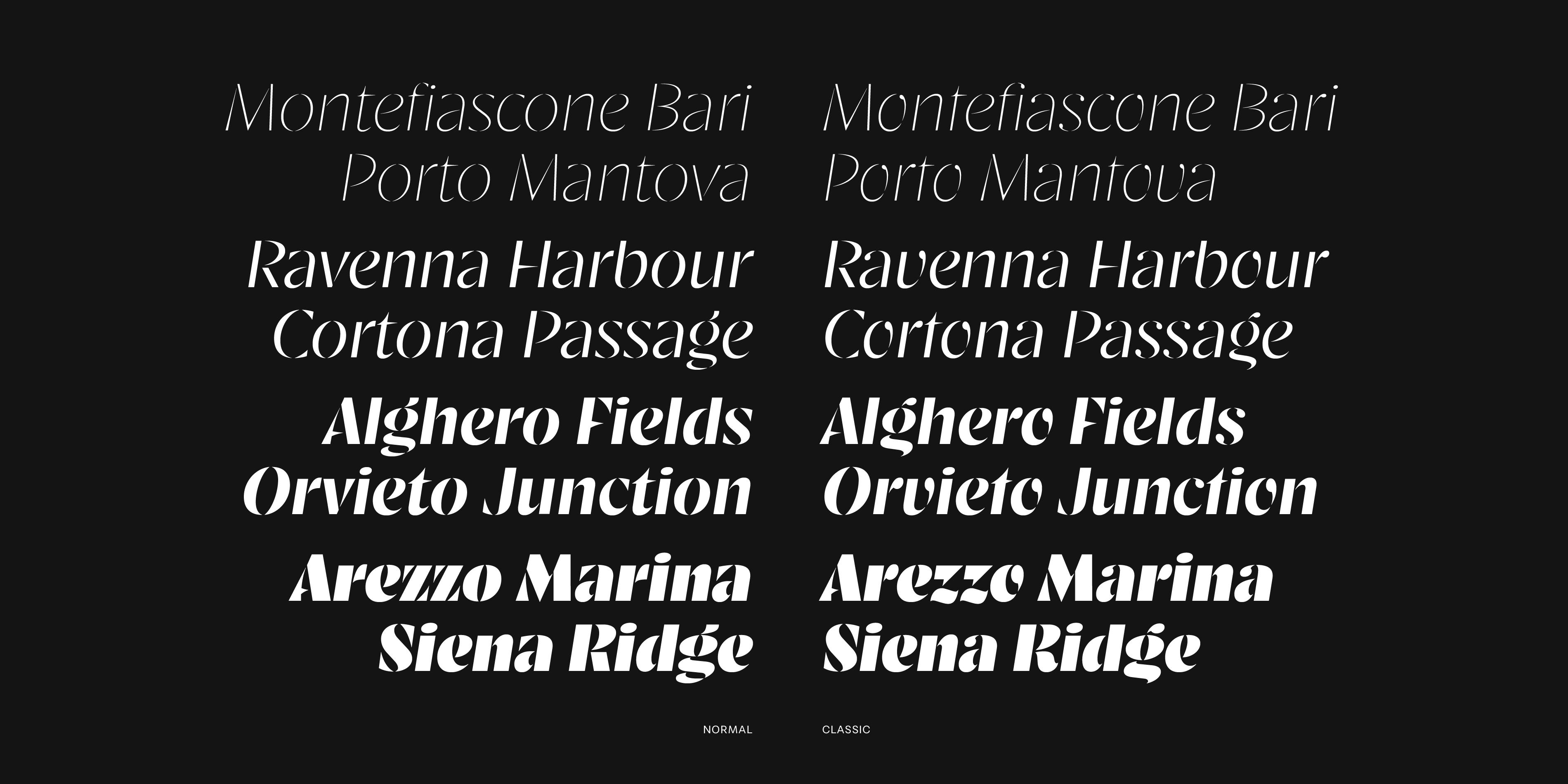
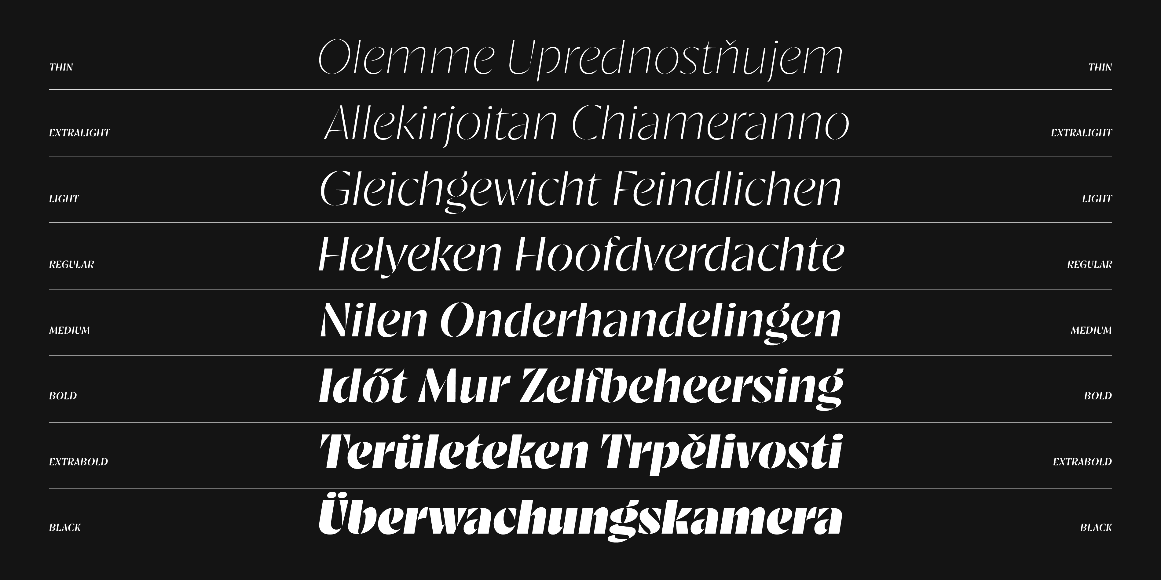
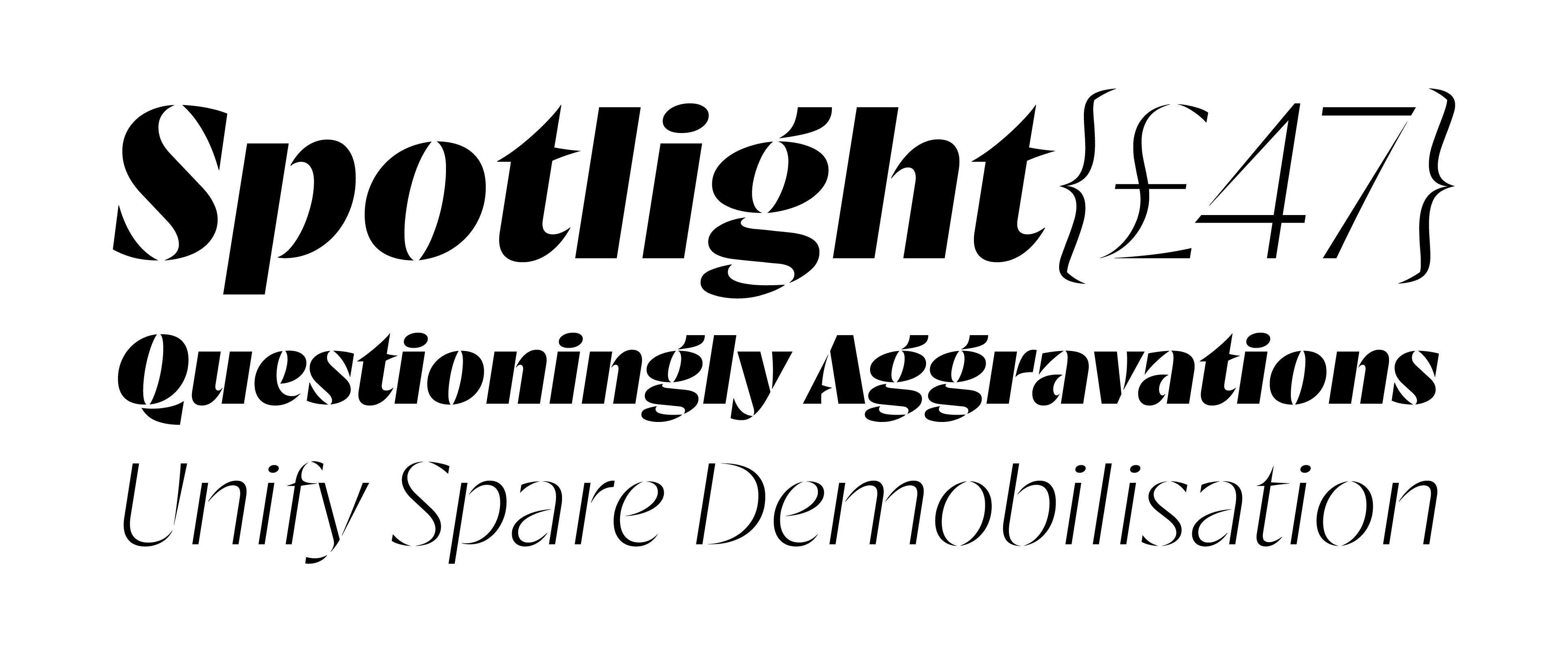
The result is a variable typeface built around two primary axes: Weight and Classic. The Weight axis extends the distinctive spirit of the original heavy stencil into a wider range of typographic possibilities. While the historical version existed only as a single bold weight, expanding the spectrum reveals how the design behaves under different levels of visual pressure. In lighter weights the stencil interruptions become more delicate, emphasizing the geometric skeleton of the letters. As the weight increases, the forms gain density and impact, returning to the bold presence that defines the original specimen. The Classic axis introduces a different kind of exploration. Rather than changing the weight of the strokes, this axis adjusts the relationship between the revival and the historical source. At one end the design stays close to the proportions and construction observed in the original specimen. At the other the forms evolve toward a more contemporary interpretation.
These adjustments are often subtle. Curves may become slightly more controlled, terminals may shift in tension, and proportions may adapt to modern typographic expectations. None of these changes aim to erase the historical reference; instead they create a continuum between past and present. Spacing and rhythm also played a central role in the revival.
Design Notes
Ultimately, RST Resolut aims to preserve the bold personality that made the original design memorable while expanding its possibilities for contemporary use. It respects the historical character of Brünnel’s work without treating it as something fixed or untouchable. What began as a single heavy stencil typeface has become a variable system capable of moving across different weights and stylistic interpretations. The spirit of the original remains visible in every instance, but the design now occupies a wider typographic landscape. RST Resolut is therefore not only a revival of a historical artifact. It is also an exploration of continuity in design, how typographic ideas travel through time, how they are reexamined, and how they can be extended without losing their original voice. The process of developing this project was a particularly rewarding experience.